
This logo was designed for Farnaz Cake & Catering, a UK-based bakery and catering company. The design reflects the brand’s warm, elegant, and handcrafted approach to creating memorable culinary experiences.

A business card was designed to reflect the brand’s elegant and handcrafted identity, maintaining consistency with the logo design.
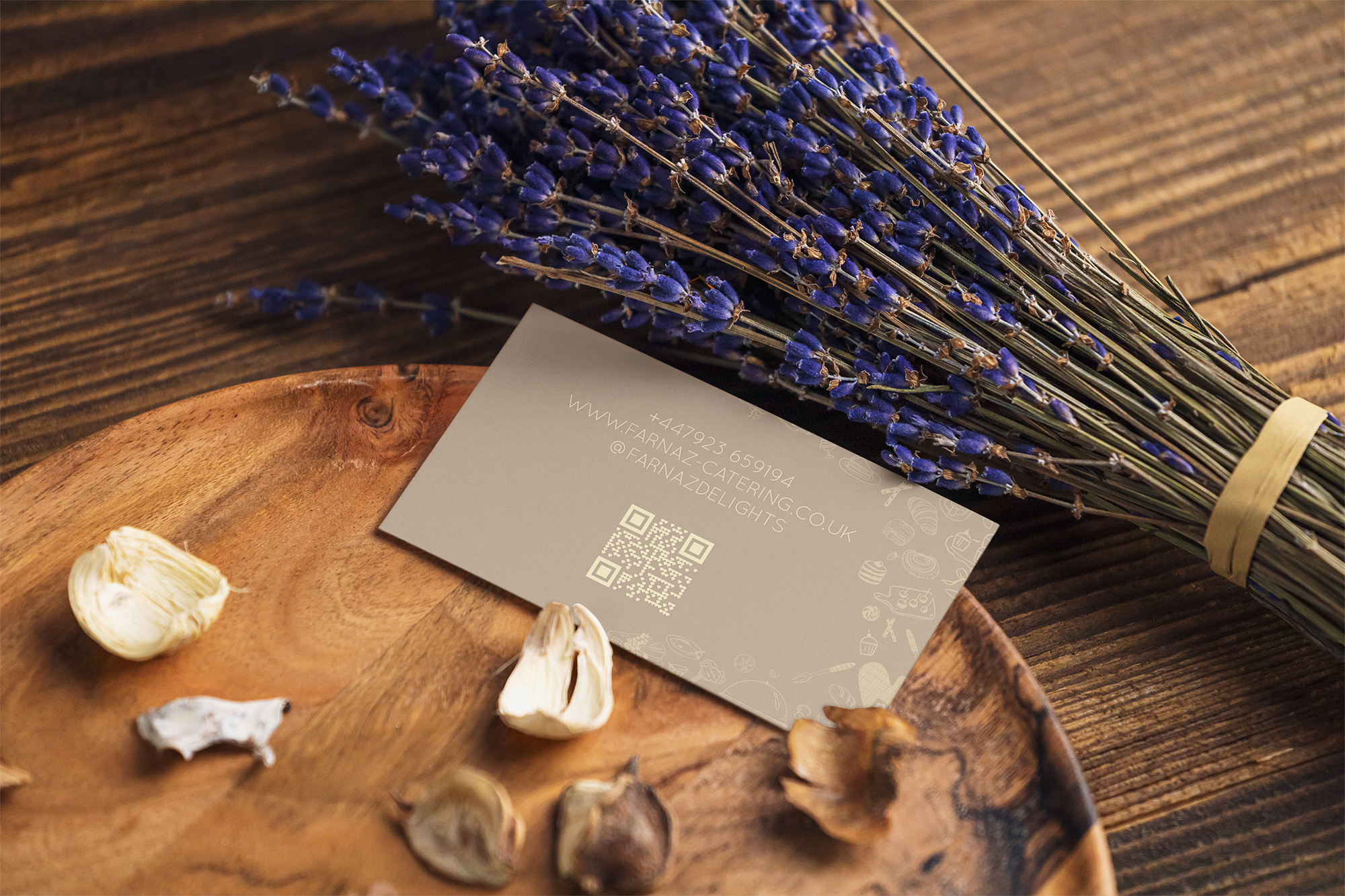
A business card was designed to reflect the brand’s elegant and handcrafted identity, maintaining consistency with the logo design.

This logo was designed for a construction company "Hesari Construction Co" specializing in residential buildings. The client requested a bilingual typographic logo featuring both the English and Persian versions of the company name.

This logo was designed for a construction company "Hesari Construction Co" specializing in residential buildings. The client requested a bilingual typographic logo featuring both the English and Persian versions of the company name.
A gold gallery logo design. Laradice is an Italian name using for a holding that consider to utilise this logo for their cosmetic and beauty company. So, I combined woman's face, gold colour and typography to illustrate both concepts together
Mahoortak is a logo designed for a dried fruit shop using two kinds of fruit to show the concept
This logo was designed for a construction company specializing in residential buildings. The client requested a bilingual typographic logo featuring both the English and Persian versions of the company name.
Kar Kia Sourena Designed for an International transportation company on which the 2 arrows with different colours around the world map illustrate an International transportation
Mahoortak is a logo designed for a dried fruit shop using two kinds of fruit to show the concept

Mina Typography